Grid Design
8 July 2016
ACM Finance Magazine
10 July 2016

Concept
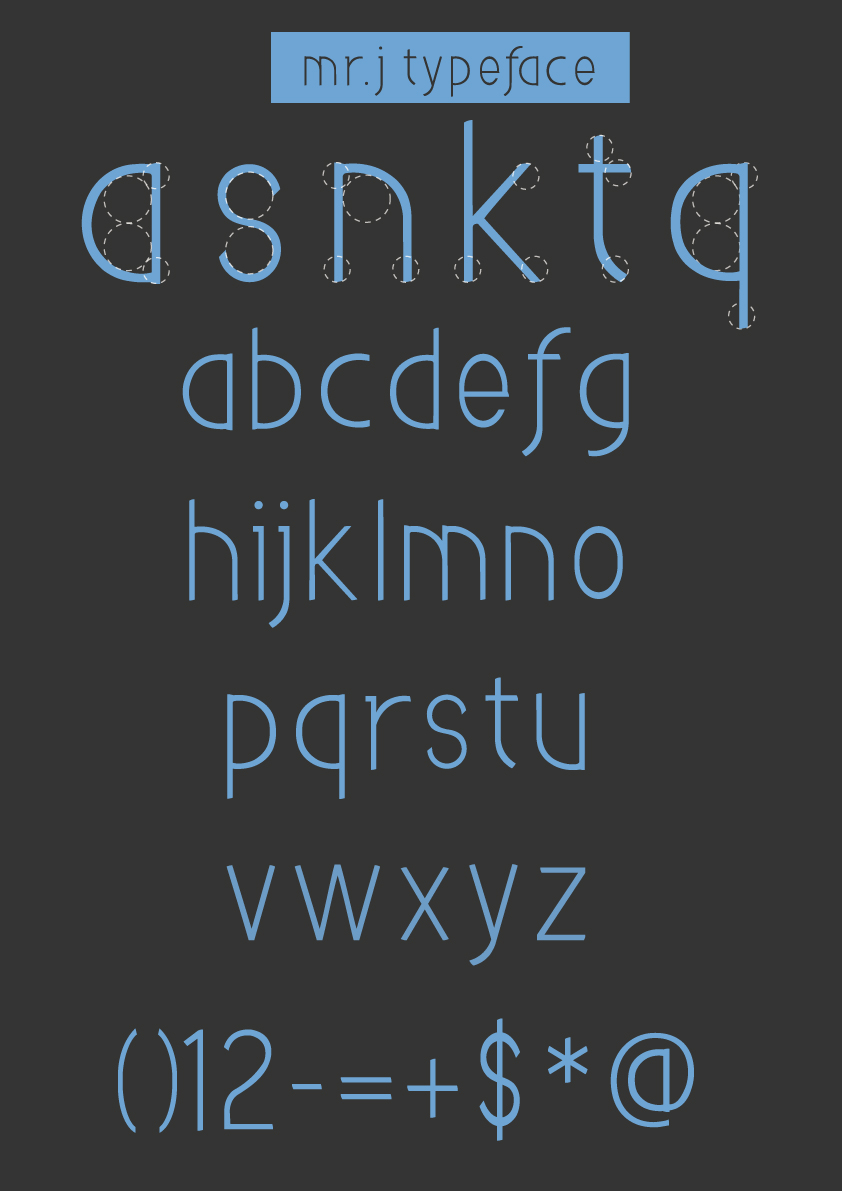
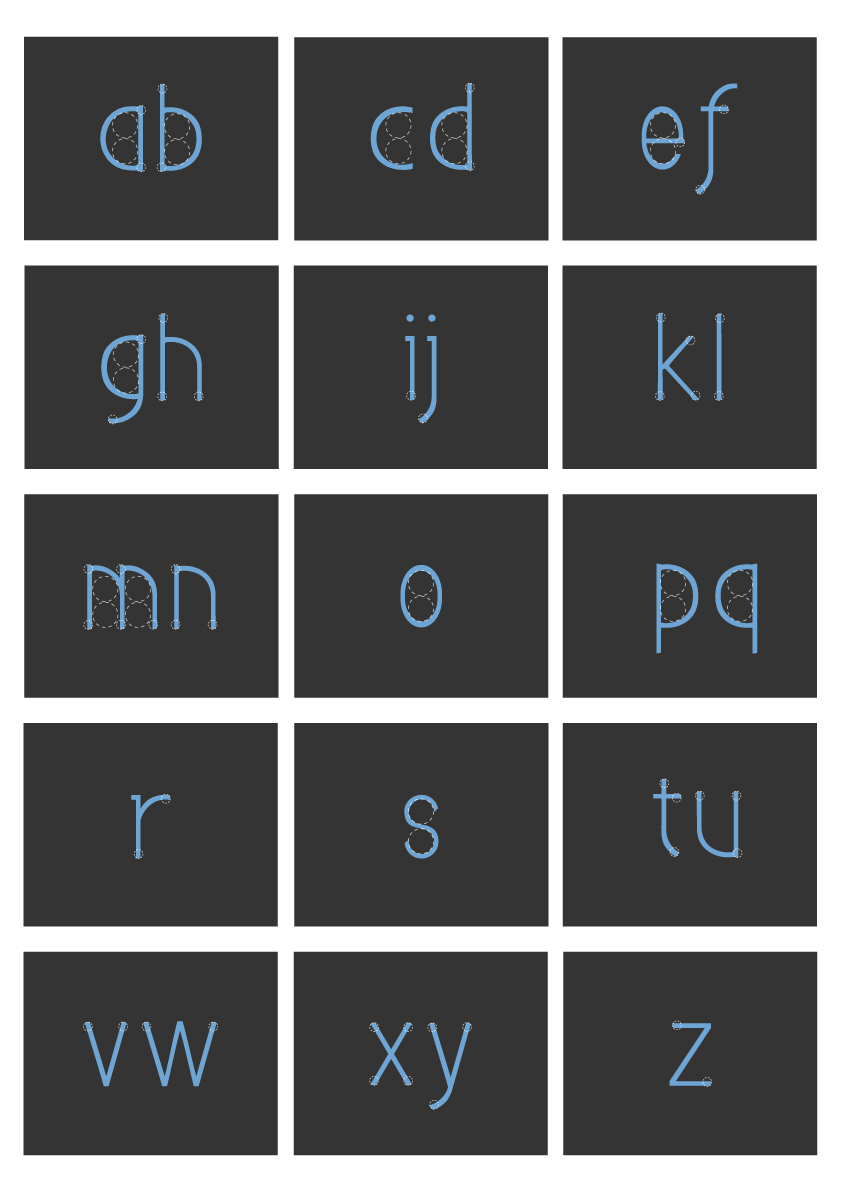
Mr. j was designed as an experimental typeface inspired by alphabet ‘j’ context. As from the context, the ‘open shape’ of this alphabet is large and the vertical ‘weight’ of the stroke is thinner. these characteristics attribute to Mr. j typeface design with large open shapes and large x-height. Moreover, Mr. j is a simple sans serif typeface designed with thin slender lines allow for its subtle characteristic and legibility.
Mr. j is versatile, but personality. The size of every characters are same, except the width of alphabet ‘s’ is shorter, it created from the negative space of the ‘counter’; and the width of alphabet ‘m’ and ‘w’ are wider. this font design especially for on screen and digital environment and also typeface design for children food packaging, in addition to this, the open shapes and a large x-height keep it legible in small text, that makes it well-suited for a great variety of typographical task such as display typeface, brochures, magazines,posters, websites, subtitle, or headlines.
